#banner-ads { margin: 0px; padding: 5px; text-align: center; } #banner-ads img { margin: 0px 4px 4px 0px; padding: 3px; text-align: center; border: 1px solid #c0c0c0; } #banner-ads img:hover { margin: 0px 4px 4px 0px; padding: 3px; text-align: center; border: 1px solid #333; }

Thursday, August 30, 2012

As Good as it Gets...


Colonial style building from outside, lines of classic wodden ceiling at the lobby, used oldhouse bricks, this apatment welcomes me with its warmth. 

Soon after I enter the 3rd tower lift, going up to the 5th floor, I keep wondering the home owner of young couple that I want to review, must be the New York and American Classic at heart. But the reality is far from what I've been thingking, truly madly wrong...


The first of them is the appearance of painted dark grey solid foyer room, with orange and white framing the all entire wall list to the ceiling and coloumn. The composition of this small foyer look so appealing, followed with the long shoes cabinet in dark wood and mirror cabinet, and pairing with the round solid mirror and white square hangging modular. 

"Hi there, I'm Felicia," the young women with the modern short hair welcoming me with her warm regards.


The following room for me personally like the opening suprise. A modern long wood dining table presented with mirror wall in one ways. The open space living room was such a pleasure, cause I can imagine watching TV while eating truly comfortable here. I dont have to move but I can have best of both world at the same time. 


Halfway through the conversation with Felicia, as I were expecting that she will said all the acessories is brought by the designer, Yuni Jie, but appreantly not. Felicia is cute hunter, she's accesories junk who like to collecting all small little thing for her home. The red antique phone is one of them. I was schocked finding out that it's functional, they can use it as the apartment phone.


I have to say, this 140 square meters apartment design is worth the money. Classic outer look don not under estimate the owner and the designer to create something light, homey and almost feel like you're not in apartment. Replica option has never been this deliciously sinful. 

The only missing at this apartment maybe the large patio, but that's okay. That being said, you know what to expect when you live in apartment, no outside retreat.

Speak to me at twitter @styledecor1

--

Jie Design
www.jie-design.com

Sun-kissed Terrace

It was a very sunny day, but somehow my mood to do outdoor photoshoot was right. And the photo session happens to be very sucessful. The location took in furniture showroom in Kemang, named Puri Artha, and we have the chance to use everything that they got in the showroom. Even actually I already borrow three brand with me for the photo session...upsss...


The first shoot was the rattan outdoor chair from Aida, Slide outdoor lamp, wood lantern from Puri Artha. This combination look very modern, but feel very chic at the same time. You can try this if you only have small courtyard corner. My second try is the pool corner using Whale lounge chair from Aida, round table bench by Alvin and box lamp from Slide.


Unlike the usual outdoor furniture you found in Jakarta, usualy from synthetic material or classic iron look, my furniture selection is more into natural material while the style is somewhat light and classier. 

I wasn't a big fan of styling outdoor area until I was introduced to Alvin T furniture, Slide lamp and see a lot of ecltectic inspiration that I got from design magazine. Only a big fan would go as far as I can bringing the personal touch to the outdoor furniture, like using three more item with different style and mix them together like a true living room out side the room..

If you have any reference for me, please contact me at my twitter @styledecor1

--
Puri Artha
www.puriartha.com
Aida Rattan
www.aida-rattan.co.id
Alvin T
www.alvin-t.com
Slide
You can buy this item in Jakarta trough Vastuhome
www.vastuhome.co.id 

Tuesday, August 28, 2012

Elegant to Steal...


"Hi Erika, we just finish designing a penthouse apartment in Senopati, do you want to have a look?" my colleague Trisna from interior Shop Elite Grahacipta just text me in early morning on my way to office. I'm curious to know what they up into, so I decide to have a look.  And voila…I feel like entering a suite hotel not an apartment…


The first appearance is the high ceiling living room. The combination of long book cabinet with graphic armchair and carpets remain me of the West Elm design. The Baccarat chandelier makes the room feels like a lace fabric. Elegan but yet feminine.


The dining room area look bit funny with the umbrella chandelier. I don’t know what Elite trying to do, but this chandelier look miss match with the silver dining chair and table, for the console table I think it will be better if they use the light palette, not with the wood solid color. 


For the entire apartment my Favorite area is in the bedroom foyer. The unique cabinet perfectly combines with the circular mirror frame.


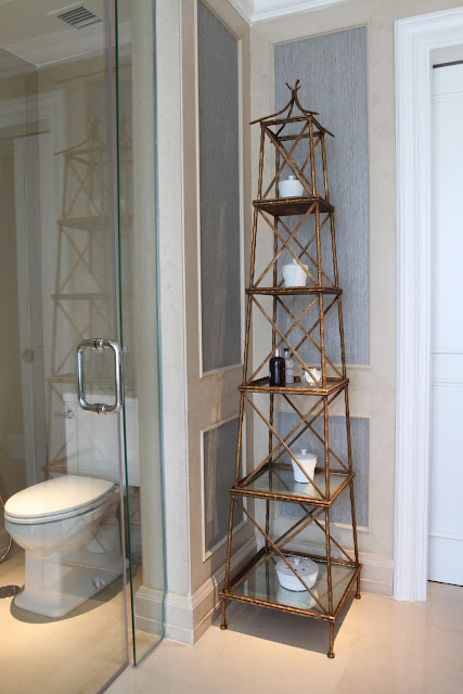
I've always been a huge fan of bathroom accessories, and this bathroom came out with a Parisian look cabinet that tickled my eyes, followed with a gray wallpaper and a mirror basin cabinet. What makes it even better is the pairing crystal lamp that comes together with it.

Do you like it? Speak to me in twitter @styledecor1

--

Elite Grahacipta
Jl Kyai Maja No 6, Kebayoran Baru

Jakarta 12120
Indonesia
Phone(+62-21) 720.8475, 726.5513, 725.7727 - 28
Fax(+62-21) 726.5512

Style Affair at Scandic Grand Central Hotel...


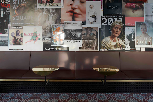
I love the way design firm Koncept Stockholm designing the Scandic Grand Central Hotel. Like the World Architceture website said that ” Koncept Stockholm have created a love affair between the grand Vienna-style city palace and the street life of Stockholm”. Indeed...the combination between The urban theatre’ storyline look very supporting for each other.


The late 19th century city palace collides with materials inspired by everyday street life and together creating a very personal and inviting atmosphere, no wonder this hotel has been nominated to the design award European Hotel Design Awards 2012. The hotel was noticed in three categories: "Bedrooms and Bathrooms", "Café, Bar or All Day Dining" and "Restaurant." 

I cant wait to hear this hotel become the winner, what do you think…?

Let me know on twitter @styledecor1

--

Scandic Grand Central
Kungsgatan 70
111 20 Stockholm
Sweden
Phone: +46 8 512 520 00
Fax: +46 8 512 520 11
E-mail:
grandcentral@scandichotels.com


Wednesday, August 1, 2012

Mad of Rattan...

It tells something more essential than simply how to choose of Rattan furniture. On one watch, the Rattan might appears as a pale looking wood with each braids step exaggerated into perfection. But I suppose, that's what it takes to remind us that every little thing of furniture craftmanship is beautiful. We just easily overlook it.


I mean, aren't every one of us has a love for great furniture? The afforable Indonesia Rattan furniture that sells in every corner of Jakarta street...Or have we forgotten? That is the case when we have a lot of something, and we know they come with bargain, we tend to take the quality for granted.

It happened to me...but not until I meet Mr. Kurt, the owner of Aida Rattan. He's Germany and he have a amazing knowladge about Rattan..


As I look at the same furniture everyday when I was a little kid, my mom has this Rattan Swing chair that use to belong to my grand father and given to my mom when shes married my dad. I forgot that we had a set of Rattan furniture at my home, because back then Rattan is something common that every family in Jakarta in late 1970's use to have for their home. 


As we grow old and the trend is coming, minimalist, modern, synthetic material... more and more trends, we tend to lose the passion to our traditional Rattan furniture. And now Aida Rattan, run by the Germany make me relize, it's time to investment with the good quality piece of Rattan furniture....Why not? This is our local resources material, we use to proud of them, why not now? 

The selection of Rattan furniture above from Aida is ready to buy, if anyone of you want to invest some item with good quality Rattan, don't hesitate to order... Believe me, one furniture that you buy from them, save the dignity of the local craftmant ship and the local Rattan farmer in Cirebon....

For order contact me at twitter @styledecor1

--


PT AIDA Rattan Industry
Block Duku Setu, Desa Bodesari
Plumbon, Cirebon West Java
Telp. +62 231 324 556 (hunting)
Fax. +62 231 324 557

Email : kurt_schuetz@me.com

Another Missing Pictures in Milano

I know its to late, but I want to share my private viewing (thanks to Domus Academy Milan and Vastuhome showroom in Jakarta who sponsored me)at the Milan Furniture Fair 2012. 


Asian, European, American or Italian, from chairs, sofa to cabinet, this new trend on the block made quite a statement on its exhibition week. Lining up on a timely manner was a series of signature release collection expected to stood out among the long list of equally interesting furniture brand. 

Some of them really strike my head personally, while some others are possibly variety pleasers. If I were to rerun that week in my own terms, here's how it would be, brand by brand, designer with designer, old and new and iconic with mass design. 


Yeaaaay.... I'd like to start from Zanotta please. Hands down, the super comfortable collection was a winner. Possibly on par with my favorite Baker and Dwell Design collection. The layers of thinly sliced super soft fabric brings out the sweet and sleek to the surface, while the modern shape adds a complementary texture.


My second choice of modern furniture will go to Driade. Tropical jungle view at the booth was a great welcome warming for the visitor, served at the right tropical style temperature, although it was a bit on the Italian touch for the sofa selection. Otherwise, it was lovely. Some of the swing chair collection from Driade making it effortlessly homey, despite of the strong modern style furniture, Italian typical.


At some point, Missoni collection it was more like the Asian meet Tribal. If you know what I mean. And the last of the herd, would be like Oscar de la Renta meet Shanghai Tang. This is definitely something I'd like to have if I own villa properties in Africa. Some huge papper lamp with tribal mood, graphic cushion with tons of colors, big arm chair sofa in earth tone & light coffee table. You shall not be disappointed especially with the way they styling the booth, almost flawlessly relaxed.


And if I still have a few rooms for more in my future properties in Africa, I would venture this Thai inspired modern lamp and inspired paper lantern chadelier. The stylish look of this both lamp was appetizing with the craftmanship. While the selection of the material for the lamp pleasing my eyes. Visually appealing for local Asian lamp ideas.

But I have to admit it, my favorite pieces from the collection above, actually far from what I want for my home...I'm still vintage modern classic at heart, but with some twist of twiggy and lil'bit country at mind.. 

I'm lucky that in Milan Fair I have a chance to interview Marcel Wanders, Piero Lissoni and Front design..


Which one is your favorite? let me know on twitter @styledecor1

--
Salone del Mobile Milan
www.cosmit.it
Zanotta
www.zanotta.it
Missoni Home
www.missonihome.it

Chic Casa by Brava Casa

Wait, that's three words or four words? Haha.! Well, inspiration are just too good to be expressed in three or  four words I guess. It feels good to finally visiting the Casa at Bravacasa exhibition in Pacific Place Mal Jakarta. Feels like reunion, I was editor for Bravacasa Indonesia magazine back in the days, and visiting their exhibition give me the perfect mind getaway of dateline and drama.


These are some of my favorite spot that I visited while I was in the exhibition for one hour escaping..I would say the highlight was definitely this color block carpet design with the art table installation. I didn't get the chance to touch the table, but here's a *thumb* for the designer.


Take a look at these lovely Red stool. Can you see the sound of them calling seat on it? Yes...that soft whisper in your head saying : "Feel me. Touch me" After a few second staring at this simple Recrate Stool, I fell weak for its red plastic seductions and and decided to quick try before some one yeelling at me. Upsss....


This wall of photos comes in a right size, enough to pamper our eyes to find out what is in the picture and the connection with the chair, but not too much to leave you wondering afterwards. Visualwise, it is slightly different from what I have in mind, this semi art showcase currently offers mix old and new feeling. It is more like crumbles of soft memory with the modern age. 


Whether it is superior to the other, is another question, cause when it comes in to exhibiton, I'm just common design lover. There's a different sensation watching young talented designers try to savoring ideas out of the box with watching selection of good functional products. 

Dear designer, what is the true message when you creating an object? Are this thing look cool cause it's modern, or people needs it? don't people need new way solution of using things? However, this is my opinion, if you haven't got bored with cute scandi trend furniture now days, start to think selecting the object base on what you need, not just because they look cool & cute !

If you agree talk to me on twitter @styledecor1

--
Brvacasa Indonesia magazine
www.bravacasa.co.id